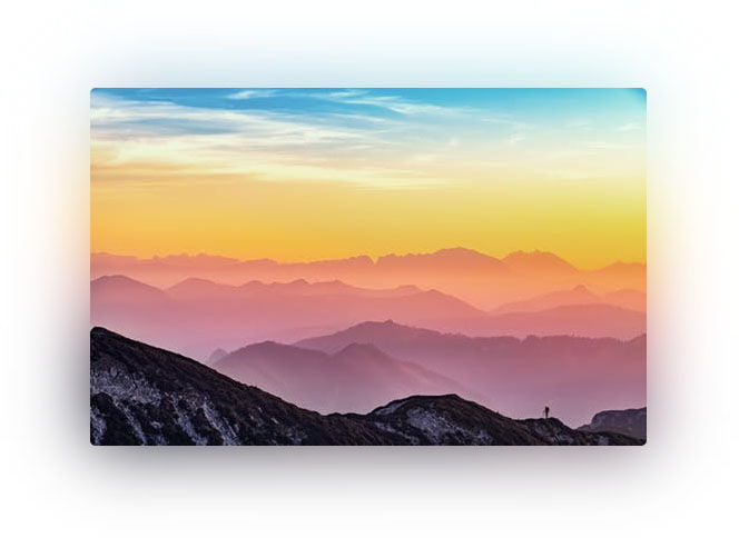
I was inspired to create multicolored shadows with CSS by a few non-web interfaces. I was able to replicate these color-matching shadows in CSS using pseudo elements, filters, and custom variables.
First I set up a div with a style attribute to hold the image URL variable and a nested image tag:
<div class="image-shadow" style="--image: url(https://images.pexels.com/photos/1323550/pexels-photo-1323550.jpeg?auto=compress&cs=tinysrgb&dpr=2&h=161&w=250)">
  <img src="https://images.pexels.com/photos/1323550/pexels-photo-1323550.jpeg?auto=compress&cs=tinysrgb&dpr=2&h=161&w=250" width="500" height="322">
</div>
Then I applied a few styles to the div and a pseudo element:
.image-shadow {
  position: relative;

  img {
    display: block;
    margin: 0 auto;
    border-radius: 5px;
  }

  &::after {
    content: "";
    position: absolute;
    top: 1%;
    left: 0.5%;
    width: 99%;
    height: 99%;
    background: var(--image) no-repeat center;
    filter: blur(30px);
    transition: all .4s;
    z-index: -1;
  }
}
Technically, using CSS variables isn’t required but I was generating the HTML markup with a PHP foreach loop and needed a way to dynamically set the pseudo element’s background image.
Play around or fork the Codepen here
Photo by Simon Matzinger on Pexels.com
